I feel bad for the designers of games like Civilization or Supreme Commander. And I don’t even want to think about World of Warcraft. I thought it was tricky to balance the different flowers in Flower Garden, so I can only imagine the amount of time and effort than went into tweaking all the properties of the many dozens of units in those games to balance them just right.
At first, things sounded simple enough: Create 20 different seeds, with varied looks and properties. I had a really cool tool to tweak the flower DNA in real time (more on that another day), so how hard could it be?
The main properties I had to balance were amount of care required (as in, how often you had to water them before they would go dry) and how long the flower took to grow. The first few flowers came along just fine, but after the fifth or sixth seed, they all started blurring together. Did I have a fast-growing flower that needed a lot of care already? To get around this, I started writing all the seeds I had done so far and their characteristics in a text file so I could refer to them easily.
After a few more seeds, I knew I was in trouble again. Reading through all the flowers was a pain, but now I was starting to forget what they looked like. Did I already have an orange flower with a few, large petals? How about a small white one with lots of rounded petals and glossy leaves? The text file didn’t cut it anymore, I had to go graphical. So I created a document with a picture of each flower along with all its relevant information (name, growth time, and amount of care).
This helped a lot, but it eventually became inadequate when I started creating the unlock conditions and balancing and the different seeds in order of difficulty. I just wasn’t able to look at a list of 20 entries, each of them with 3 key elements (care, duration, and unlock condition) and keep it all in my head to make intelligent decisions based on it.
I’m a very visually-oriented person. Whenever I can, I try to solve problem visually instead of memorizing lists or plugging equations. In particular, I love to take a multi-dimensional problem and visualize it along its main axes. So I took the next logical step to help me make sense of all that data and created a seed chart.
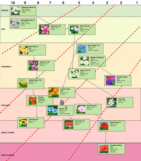
This seed chart is a two-dimensional arrangement of all the common seeds in the game, along with their picture and the key information we had before (there are another dozen bonus seeds that aren’t listed in this chart). The horizontal axis indicates how much care a plant needs. Specifically, it shows how many segments in the water meter before it dries out (and each segment is 3 hours). The vertical axis indicates the growth duration for the plant in real time. Instead of making it a straight, linear scale, I decided to go with regions, which is how they are presented in the game (“Instant”, “A few hours”, “Overnight”, “A few days”, “About a week”, and “Quite a while!”). Within the region, they’re roughly ordered by duration (shorter towards the top, longer towards the bottom).
Now it was really easy to see at a glance the key characteristics for each seed, see where I had clusters, and where I had empty spaces that no seeds were currently using. As a bonus, I was able to come up with a rough ordering indicating the level of difficulty for each seed. The further down and to the right a seed was, the more difficult it was to grow.
That allowed me to block out some regions (dotted red lines) indicating difficulty ratings, which are listed in the game in the seed information as “Piece of cake”, “Easy”, “Moderate”, “Hard”, or “Experts only”. Notice how the lines separating the regions are not parallel (even though the vertical axis is kind of logarithmic). That’s because moving along the horizontal axis increases difficulty a lot faster than moving down the vertical axis. So even a relatively complex relationship like that can be observed at a glance from the chart.
Another great benefit of the seed chart is that I was able to draw paths between seeds, showing the unlocking relationships between them. Before it was hard to see these relationships in text, but now it was very visual, and I could make sure that easier flowers unlocked the path to harder ones as long as the unlock relationship flowed roughly from the top left to the bottom right.
As a side effect, the chart allowed me to learn even more things about the data than I had expected. For example, I was able to see which colors I had used so far, and which colors I still needed to use. One really interesting thing I noticed is that colors were clustering around specific areas. Red colors seemed to be mostly in the harder flowers. Yellow colors were predominant with the dry plants, and blue colors with the wetter ones. I thought that was pretty neat, so I tweaked a few seeds here and there to make that color connection even stronger.
The lesson learned here is that the old saying applies even more in this age of information: One picture is worth one mega of words.
